
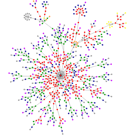
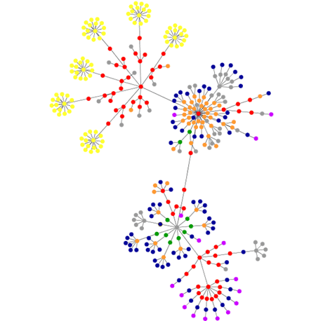
Web pages as graphs
I just saw this on Digg: A Processing applet that graphs out a visual representation of the structure of web pages. So I ran it on some of mine:
Let's start with this site. It would be interesting to compare it to other WordPress sites.


Comments
by rachel hunt on 2006-05-28 20:05:23
by Jensa on 2006-05-30 18:48:20
by aral on 2006-05-31 10:09:19